Dashboard
The Dashboard provides an overview of emissions data and platform insights for users to monitor progress toward sustainability goals.
Written By CarbonX Registry
Last updated 9 months ago
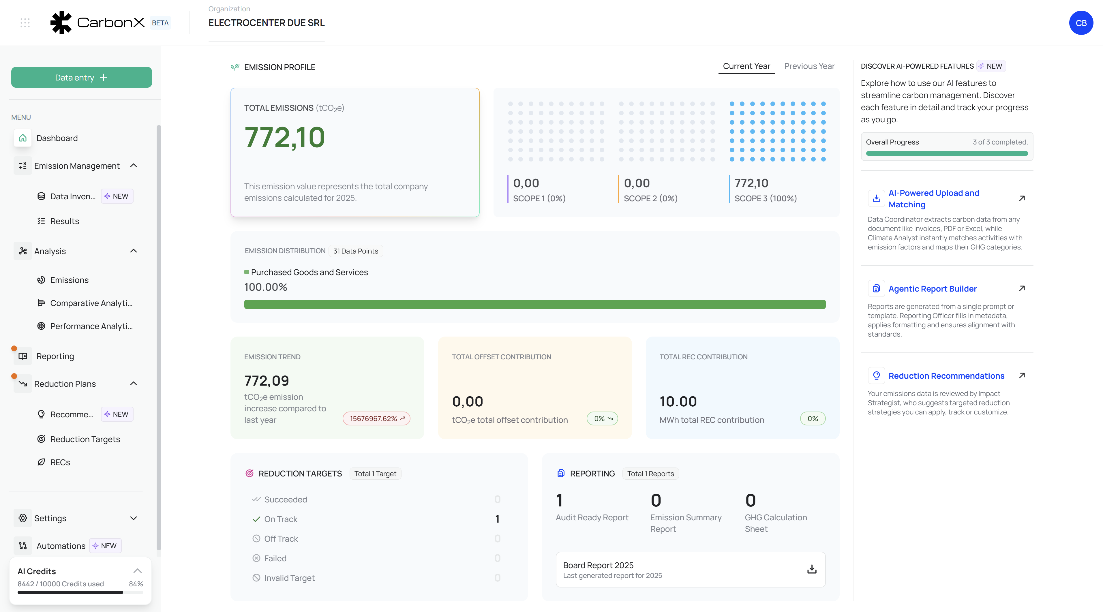
Image: Dashboard interface showing real-time emission data, AI tools, and progress indicators across all Scopes.
Centralized Overview and Insights
The Dashboard serves as the primary control and monitoring interface of the CarbonX platform, providing a unified overview of an organization’s carbon management activities, emission metrics, and AI-powered analytical tools. It consolidates all essential sustainability indicators into a single, interactive workspace — enabling executives, sustainability officers, and analysts to quickly interpret performance, track progress, and access deeper analytical modules.
1. Purpose and Functionality
The Dashboard offers real-time visibility into your organization’s carbon footprint performance. It acts as the operational center where key metrics such as total emissions, reduction targets, offsets, and reporting progress are displayed. Each visual element is designed to promote data transparency and facilitate immediate decision-making.
The top section — the Emission Profile — summarizes your total calculated emissions for the selected year, categorized by Scope 1, Scope 2, and Scope 3 in alignment with the Greenhouse Gas (GHG) Protocol. These values represent direct and indirect emission sources, giving stakeholders a clear sense of organizational impact.
On the right-hand side, users can explore AI-powered tools designed to automate and optimize sustainability workflows:
Data Orchestration Agent: Automatically scans and extracts emission-relevant data from documents such as invoices or reports, mapping them to GHG categories.
Compliance & Reporting Agent: Generates formatted, standards-aligned sustainability reports based on verified datasets.
Reduction Recommendations Agent: Offers intelligent insights and strategic options for reducing emissions in key operational areas.
2. Key Visual Components
Total Emissions (tCO₂e): Displays the cumulative carbon footprint for the selected year, updated as new activity data is entered or modified.
Emission Distribution: Illustrates proportional contributions by source category (e.g., Purchased Goods & Services, Business Travel). This view helps identify high-impact emission areas.
Emission Trend: Compares year-over-year changes in emissions, visually representing increases or reductions and providing percentage deltas for performance tracking.
Offset and REC Contributions: Quantifies compensatory measures such as renewable energy credits (RECs) and offset projects.
Reduction Targets: Tracks target achievement status, categorizing progress as Succeeded, On Track, Off Track, Failed, or Invalid.
Reporting Summary: Displays all generated reports, including audit-ready and emissions summaries, ensuring regulatory compliance and documentation consistency.
3. User Workflow
Log in to the Dashboard. The user is immediately presented with emission summaries and trend visualizations.
Review Annual Emission Totals. The interface automatically distinguishes between Scopes 1, 2, and 3.
Analyze Distribution Data. Hover over specific bars to reveal detailed percentages for each emission source.
Evaluate Progress. Use reduction target indicators to assess alignment with corporate sustainability goals.
Access AI Tools. Click any AI feature panel to open automated functions for data ingestion, report generation, or strategic analysis.
This logical flow ensures quick situational awareness, minimizing manual navigation.
4. Best Practices
Regularly update your activity data under “Data Entry” to maintain accurate Dashboard insights.
Use the Year Selector to compare performance across multiple reporting periods.
Leverage AI-powered modules for faster data processing and consistent methodology across all reports.
Review emission distribution charts before setting new reduction targets to focus on major contributors.